
Casa


Hi, I'm Jordan
I'm a Creative Technologist based in Denver, and I’m excited to take you behind the scenes of one of our most transformative projects for T-Mobile for Business. This project was a full-on reinvention of how their partners sell, learn, and grow. Let’s get into it.
👋
Making complexity feel easy (and kinda fun)
Turning ugh into ohhh with scalable UX
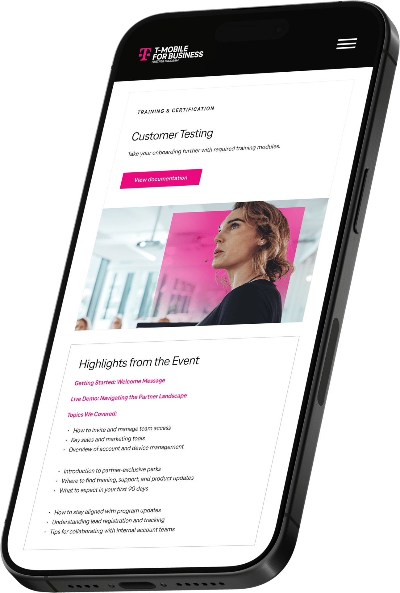
The T-Mobile for Business Partner Portal Project is a website portal revamp to help sales enablement for official resellers of T-Mobile solutions and products.
The T-Mobile for Business Partner Portal Project is a website portal revamp to help sales enablement for official resellers of T-Mobile solutions and products.
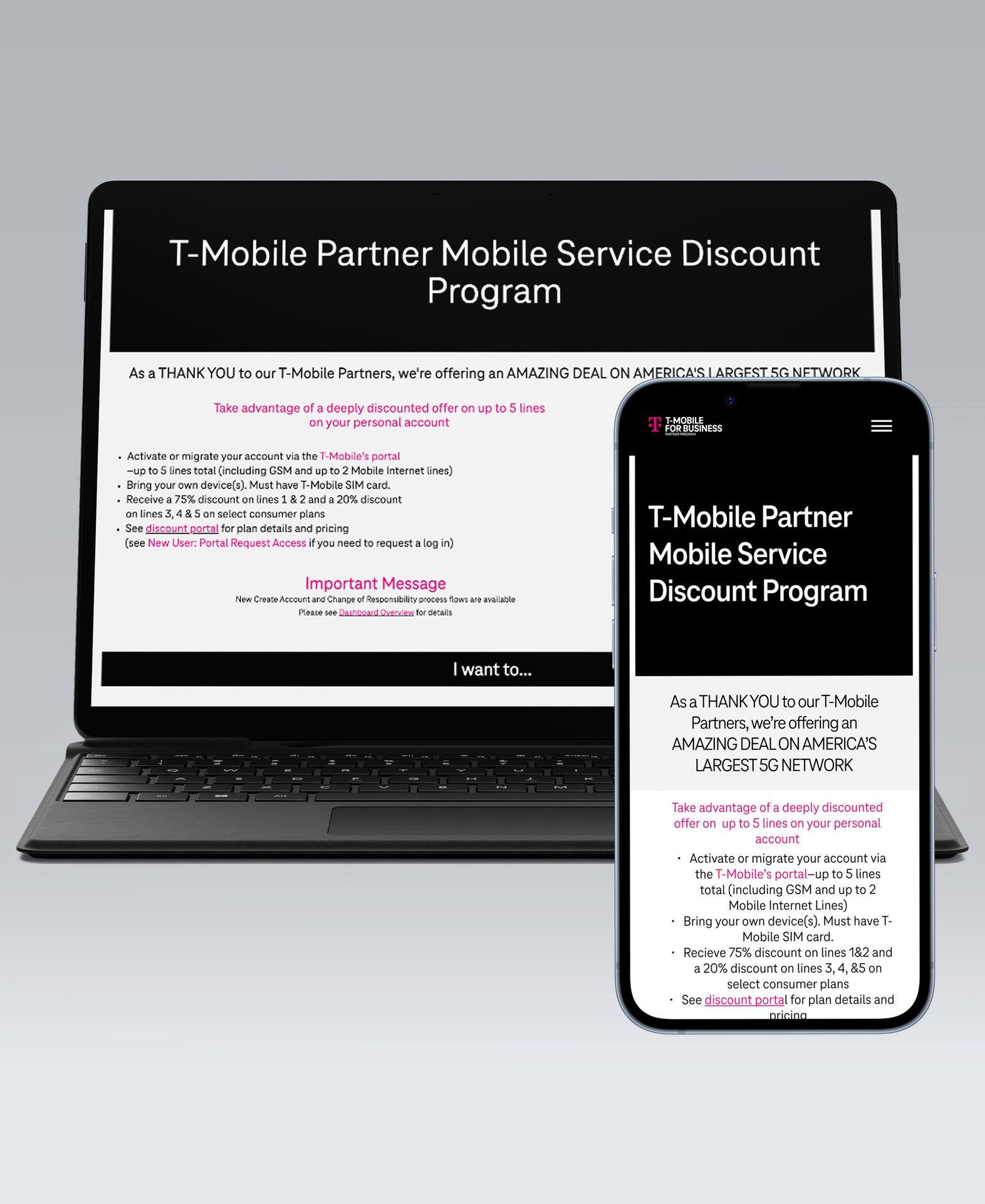
While the full portal is gated, you can view the public-facing recruitment page I designed for T-Mobile
Lead UI/UX Designer, Co-strategist
+
Role
Project kickoff: Late 2023
Project launch: Mid 2024
We still manage and provide ongoing support to the portal based on analytics.
+
Project date
Project kickoff: Late 2023
Project launch: Mid 2024
We still manage and provide ongoing support to the portal based on analytics.
+
Project date
brief in brief
A quick look at outcomes
Success can be measured in numbers or stories. Here are some stats to back up the impact this work had.
in sales opportunities generated
+0.0 m
Reduction in support tickets post-launch
0%
of targeted accounts engaged post-launch
1%
Award-winning recognition
Increased self-service adoption
Reduced partner onboarding time by 50%
Why we love it
why we love it
Scale through systems
We implemented reusable, CMS-friendly wireframes and components that flex across campaigns — from Power Up to T-Priority to Connected Laptops — enabling the client to scale and self-manage.
To design a flexible, CMS-friendly system that work across campaigns. This will empower the client to self-manage content efficiently. We also aim to introduce a UX strategy that included improved navigation, clear CTAs, and breadcrumbing for clearer navigation patterns
+
Redesign with purpose
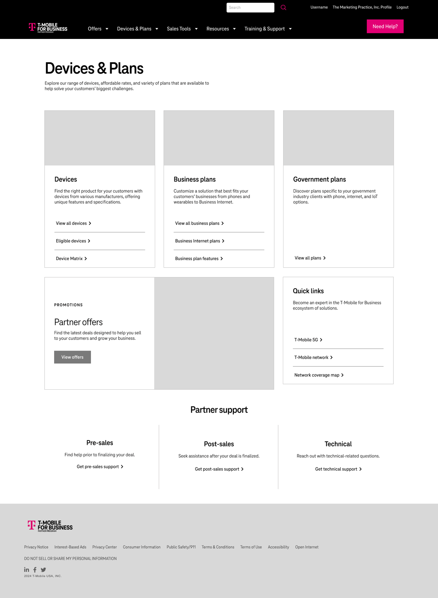
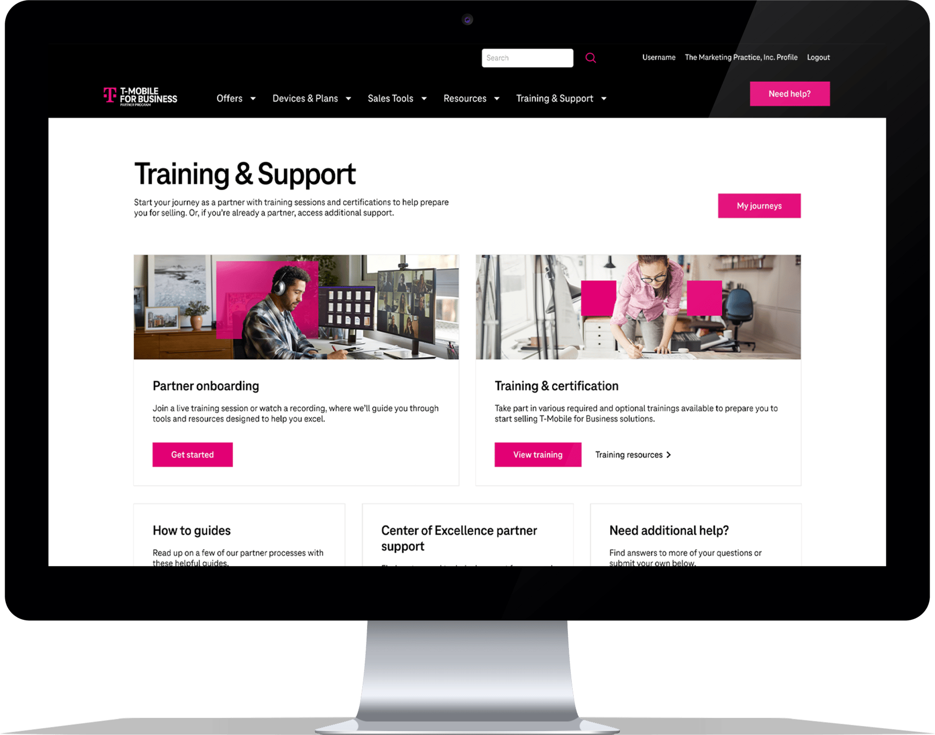
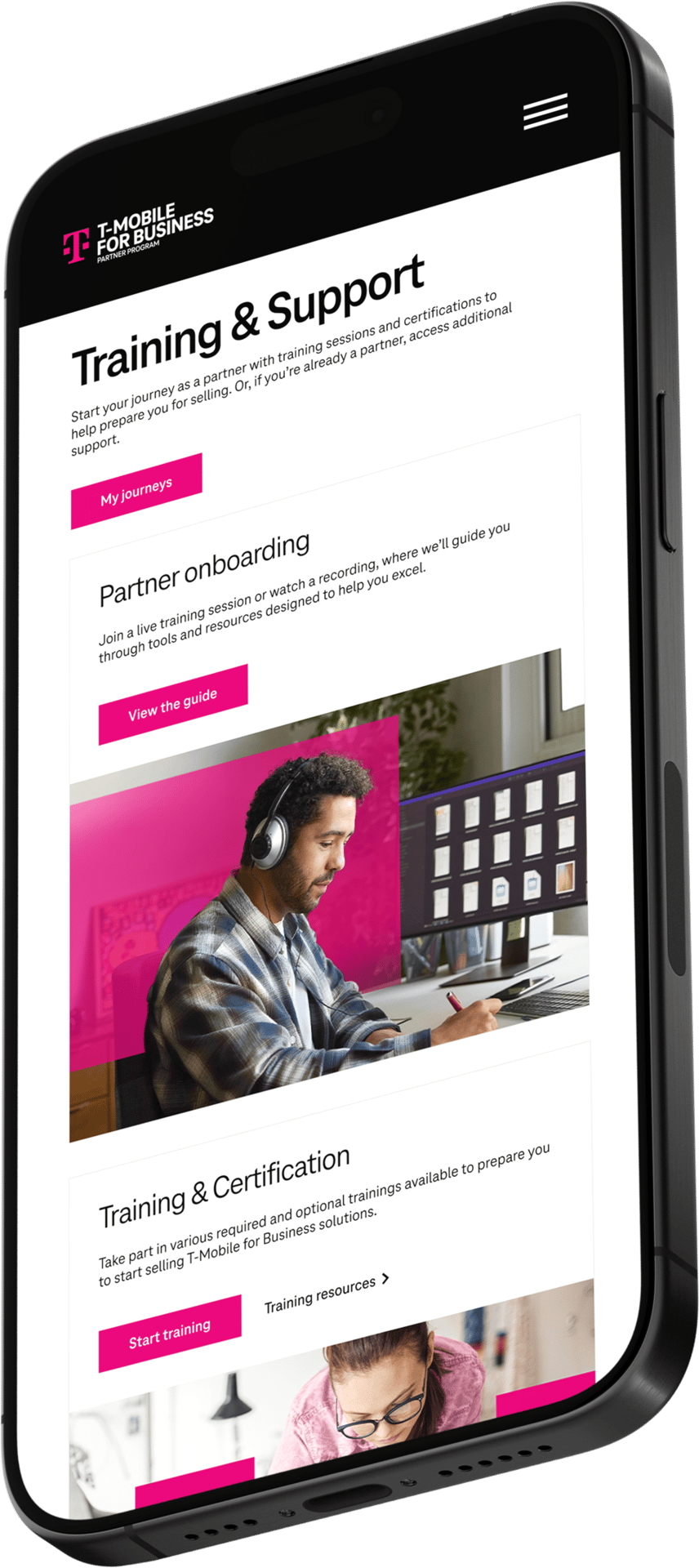
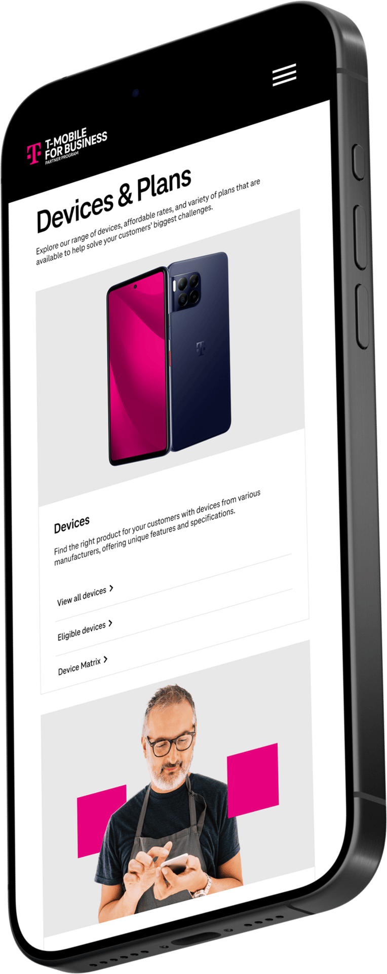
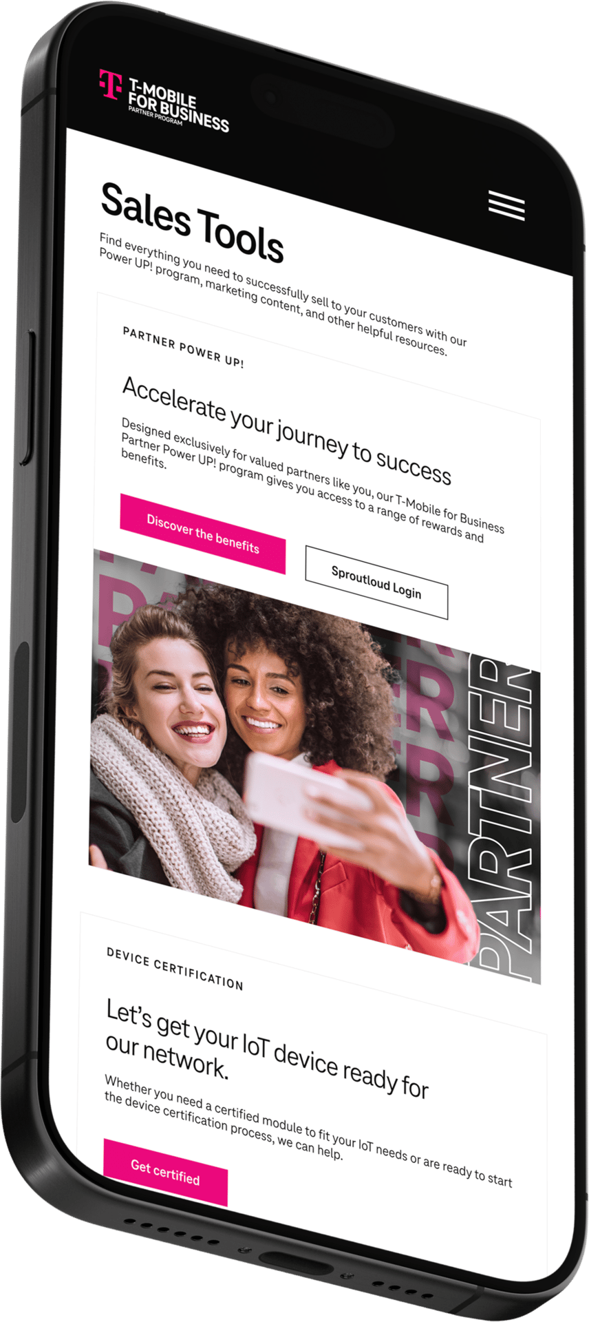
The homepage and IA were rebuilt around role-based priorities: onboarding, selling, training, and rewards. Navigation was restructured to support sales workflows at every level.
To truly restructure the experience around our users. Each experience was aligned to a core partner goal: recruitment, enablement, or advocacy. This role-based system gave partners more autonomy and clearer paths to value.
Project rollout strategy
To approach this large-scale redesign in three clear phases to minimize disruption and prioritize business impact. Internally, focusing first on high-priority fixes, then tackling structural improvements, and finally introducing interactive tools to support long-term growth.
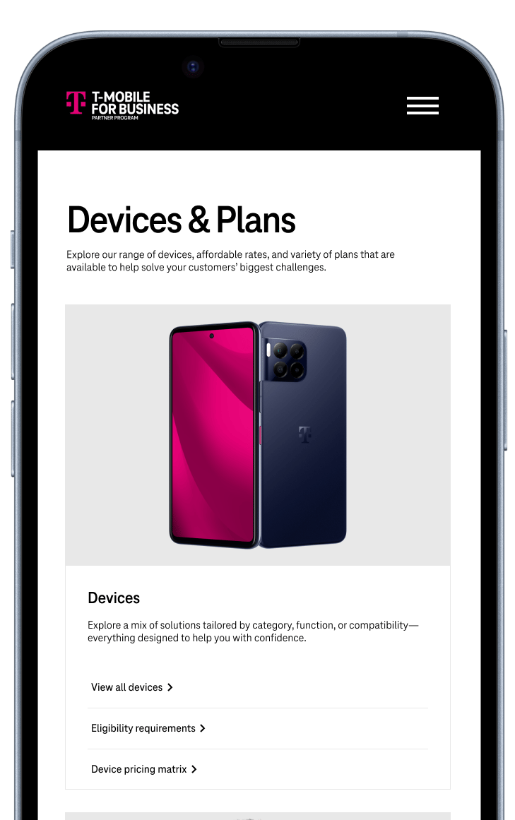
Unauthenticated: recruitment
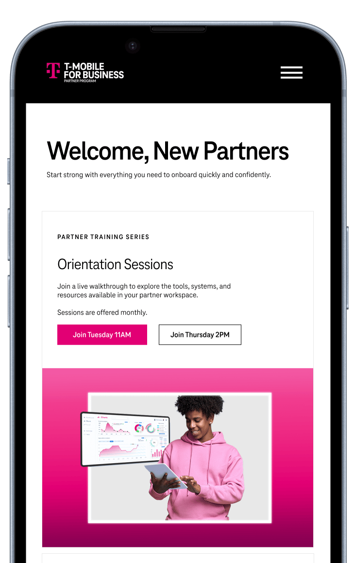
Authenticated: enablement

The T-Mobile for Business Partner Portal is the primary hub for official resellers to register deals, access sales tools, and activate co-branded campaigns. Internally dubbed the “holy grail,” it’s a cornerstone of partner enablement. But over time, the portal became bloated, difficult to navigate, and misaligned with partner needs. Our team was brought in to reimagine the experience, making it scalable, modern, and tailored to how partners actually work.
For context
a little background
Introduction
Design objectives
3
2
1
- Figma for design + prototyping
- Miro for white boarding + journey flows
- GA4 + power BI for audience + tagging
- VSCode + Azure + Impartner for development
- Teams + stakeholder interviews for feedback
Design stack


toolkit
Toolkit
We studied the site in two ways: auditing what was missing and what wasn't working. The portal had become a dense archive of static content, lacking structure, clarity, and accessibility. It wasn’t built for partners but instead it became a tool for quickly onboarding new partners.
Not built for scale or clarity
The problem
uncovering core issues
We spotted issues right away (and I'm sure you do, too)

Cognitive Load: When the amount of information coming in exceeds the space we have available, we struggle mentally to keep up—tasks become more difficult, details are missed, and we begin to feel overwhelmed.
Cognitive overload
Content was redundant, outdated, and hard to search

Hick’s Law explains that the time it takes for a person to make a decision depends on the number and complexity of choices available to them. So if the number—or complexity—of choices increases the time to make a decision increases.
Unintelligible user paths
Dozens of pages split the users path; everything was murky
🚨

Zeigarnik Effect states that people remember uncompleted or interrupted tasks better than completed tasks.
Not responsive
Mobile users could barely use the site, very problematic for a company that sells phones.

Jakob's Law states that users spend most of their time on other sites. This means that users prefer your site to work the same way as all the other sites they already know.
No clear navigation
Navigation was just as overwhelming, no clear content hierarchy or user flow
Once we aligned on the core issues: scalability and a lack of user-centered design, we moved from surface-level observations to structured discovery. Our team is not one that provides bandaid solutions.
This phase sharpened our thinking and gave us a solid foundation to evolve from. I’ll spare you the marathon recap and just walk through the most insightful parts of our discovery.
Uncovering the why
Research and discovery
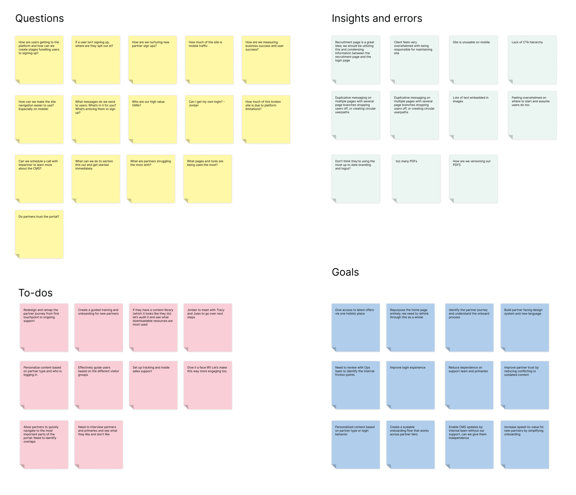
Discovery synthesis board
The sheer volume of pages was overwhelming and we were jumping in headfirst. Through group syncs and whiteboarding, we started to orient ourselves: What did we need to know? Where were the biggest pain points? And most importantly, what kind of experience did we want this portal to deliver?
Analyzing information architecture
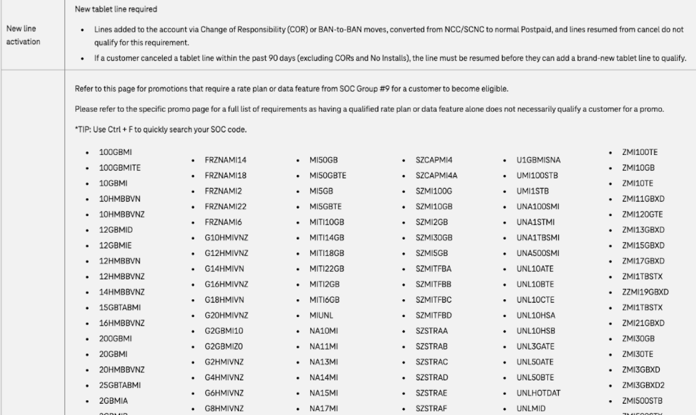
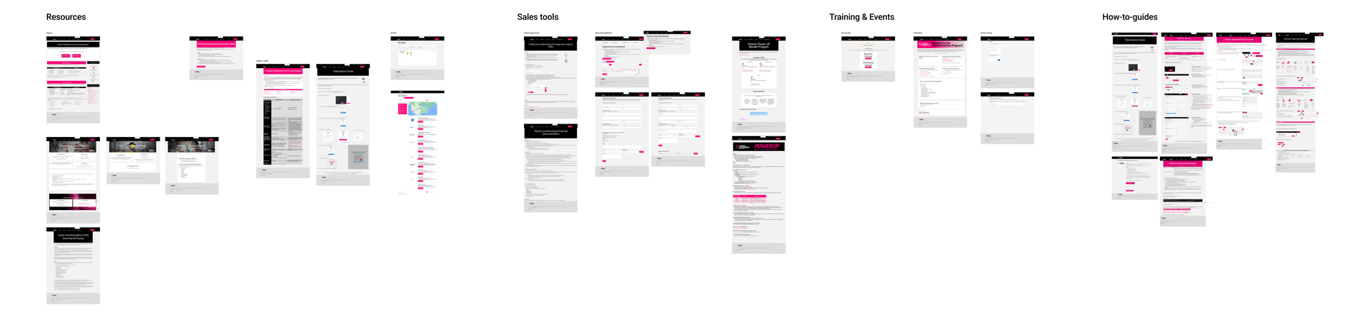
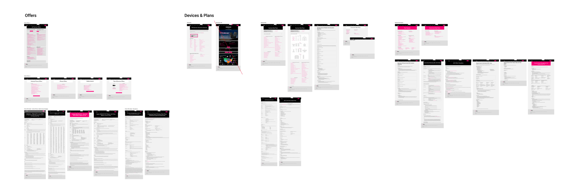
We began by analyzing the current site structure: every page helped us identify the end-to-end journey. Through this audit, we uncovered six major content groupings: Offers, Devices & Plans, Resources, Sales Tools, Training & Events, and How-To Guides.
These categories weren’t clearly defined in the portal, but we reverse-engineered them based on patterns and overlaps.
Organizing the content this way helped us understand both what the portal was doing and what the original intent might have been. We then understood where it had drifted off course. This work also shaped the questions we brought into stakeholder interviews, reinforcing our goal to understand why it broke.
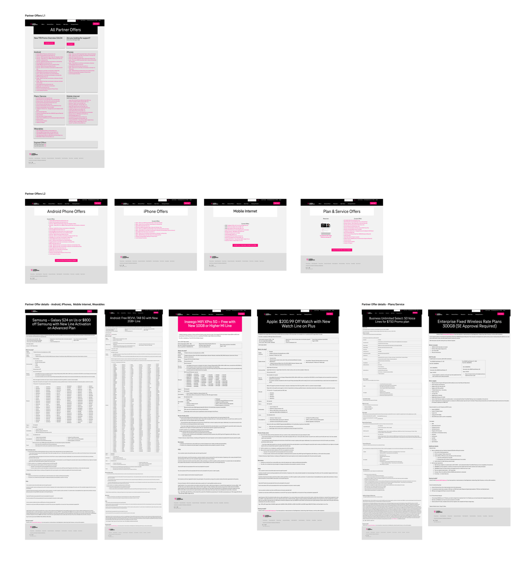
Partner Offers L1
Partner Offers L2
Acts as a hub or overview for all currently available offers.
Lists promotions by category or audience (new customers, devices, limited-time).
Gives users a summary view before clicking into details.
Each one provides specific information about a single offer.
Includes: Eligibility requirements, Promo terms, Disclaimers and fine print. CTA (Redeem, Shop Now, Add to Cart)
Move to Recruitment page
The FAQs are better suited on the recruitment page, where it can address questions from prospective partners.
This ensures its relevance and effectiveness in guiding potential partners through their decision-making process.
Recommend removing this section
Avoid using content that leads visitors away from the page to help maintain focus, preventing distractions that divert visitors away from the primary conversion goal.
Reiterate login CTA and move video to Recruitment page
Add section above this for existing partners, simple clear instructions to access the portal, reducing reliance solely on the Login CTA button in the header. Consider changing the content hierarchy, leading with the section for existing partners, as they will be the majority of visitors.
This content would provide more value on the recruitment page.
Hero copy
The copy is brief and to the point, which is good for clarity. Although it is a little vague in conveying the value proposition of the partner program, potentially leaving visitors wondering about the partnership's actual impact.
Consider clarifying the value proposition: Replace "business bravely" with a more specific statement that highlights the benefits or unique selling points of the partner program.
Call-to-Action (CTA) improvement: Instead of a generic "Learn more" CTA, consider using a more specific and action-oriented CTA that clearly communicates the next steps for prospective partners. For example, "Explore partnership benefits" or "Get started with our partner program."
Diagnosing UX breakdowns
Once we had grouped the portal’s pages, we zoomed in on the most high-traffic touchpoints, starting with the page users first see when they log in. From there, we mapped user paths across both authenticated and unauthenticated states.
We looked for friction: unclear CTAs, redundant content, dead ends, and messaging that didn’t align with the user’s goals. Our goal was to identify how users moved from Point A to Point B, where they got stuck, and how we could improve both clarity and momentum using UX best practices.
Stakeholder interview discoveries
While strategy covered our 1:1 interviews and I wasn't involved, I reviewed their notes and found these two quotes especially telling. Together, they capture both the business and user friction points we needed to solve for. This really inspired me and validated my assumption earlier on: scale and clarity were needed here.

We’ve had no support building this.
Our marketing team has done their best to keep things updated, but it’s become so unmanageable."
Stakeholder interview
See how we juggled user and business outcomes
I know the content is there somewhere, I just can't remember how to get back to it."
Stakeholder interview
See how we untangled internal content struggles
Audited the site across gated and ungated experiences
01
Interviewed internal teams (sales, ops, partner enablement)
02
Evaluated navigation structure, content usage, and searchability
03
Discovered unauthenticated and authenticated user needs
04
Interviewed key Partner accounts to understand user pain points
05
Ran team whiteboarding sessions to synthesize patterns and align around priorities
06
Recapping research
We synthesized insights from interviews, audits, and whiteboarding sessions to uncover the root causes behind the platform’s breakdown. These constraints informed every part of our redesign strategy.
What we found
The accessibility issues were driving high bounce rates, low sign-ups, and added strain on internal ops.
06

Internal marketing team was responsible for the experience and struggled to implement UX best practices
05

UI was not on brand; old logos, colors, and fonts were used sitewide.
04

Every user was funneled through the same experience, despite having very different needs
03

Navigation was shallow and flat–too many clicks to value and didn't reflect what users really needed.
02


No way to self serve for partners. New partners didn't know where to start, existing partners couldn't find anything either.
01
gathering the constraints

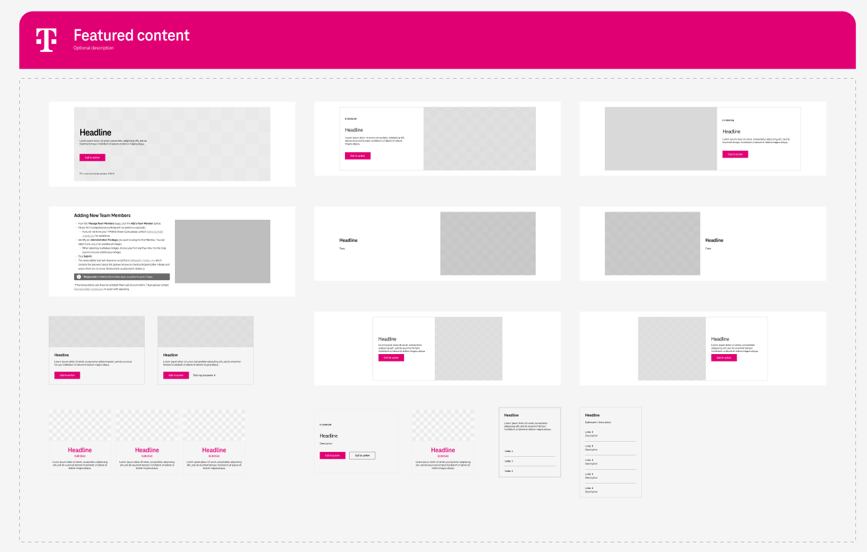
To support modularity and scale, we created a flexible set of reusable UI components that could adapt across campaigns, solutions, and partner tiers. These CMS-friendly building blocks ensured the client could update and remix layouts without developer support.
Component library
Client education on usage and governance to ensure consistent rollout and long-term ownership.
Cards, tabs, accordions, and progress bars
Flexible sections that adapt by campaign or partner tier
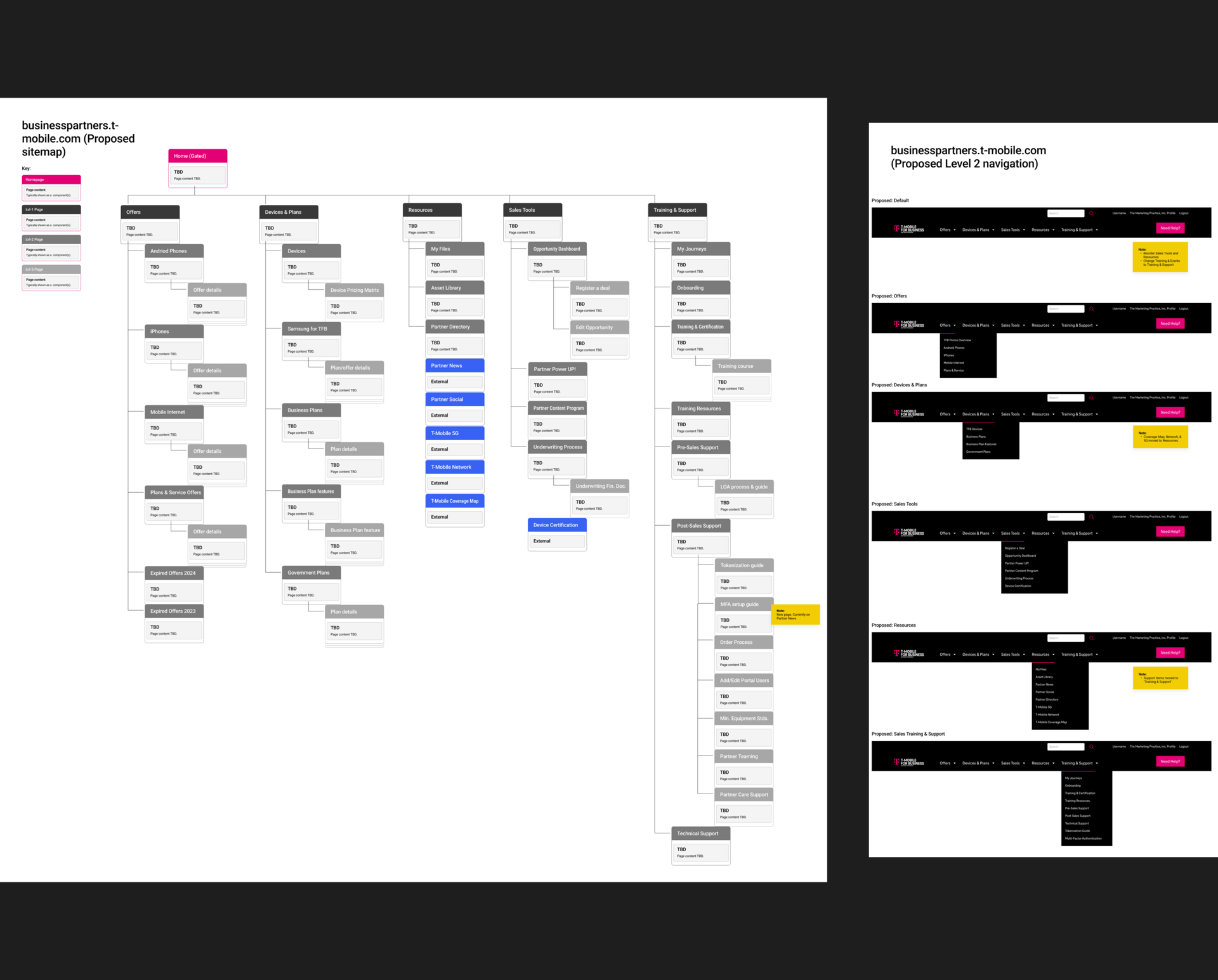
We designed a flexible information architecture that could scale alongside the client’s ongoing product launches and partner programs. With future-proofing in mind, we focused on simplifying the site structure by consolidating overlapping pages and improving navigation for clearer wayfinding.
Modular architecture
Replaced outdated content with timely campaign offers and CTAs, and flagged areas for future updates
Created dedicated sections by solution (T-Priority, Business Internet)
Collaborated with inside sales to align structure with onboarding needs and support new partner activation
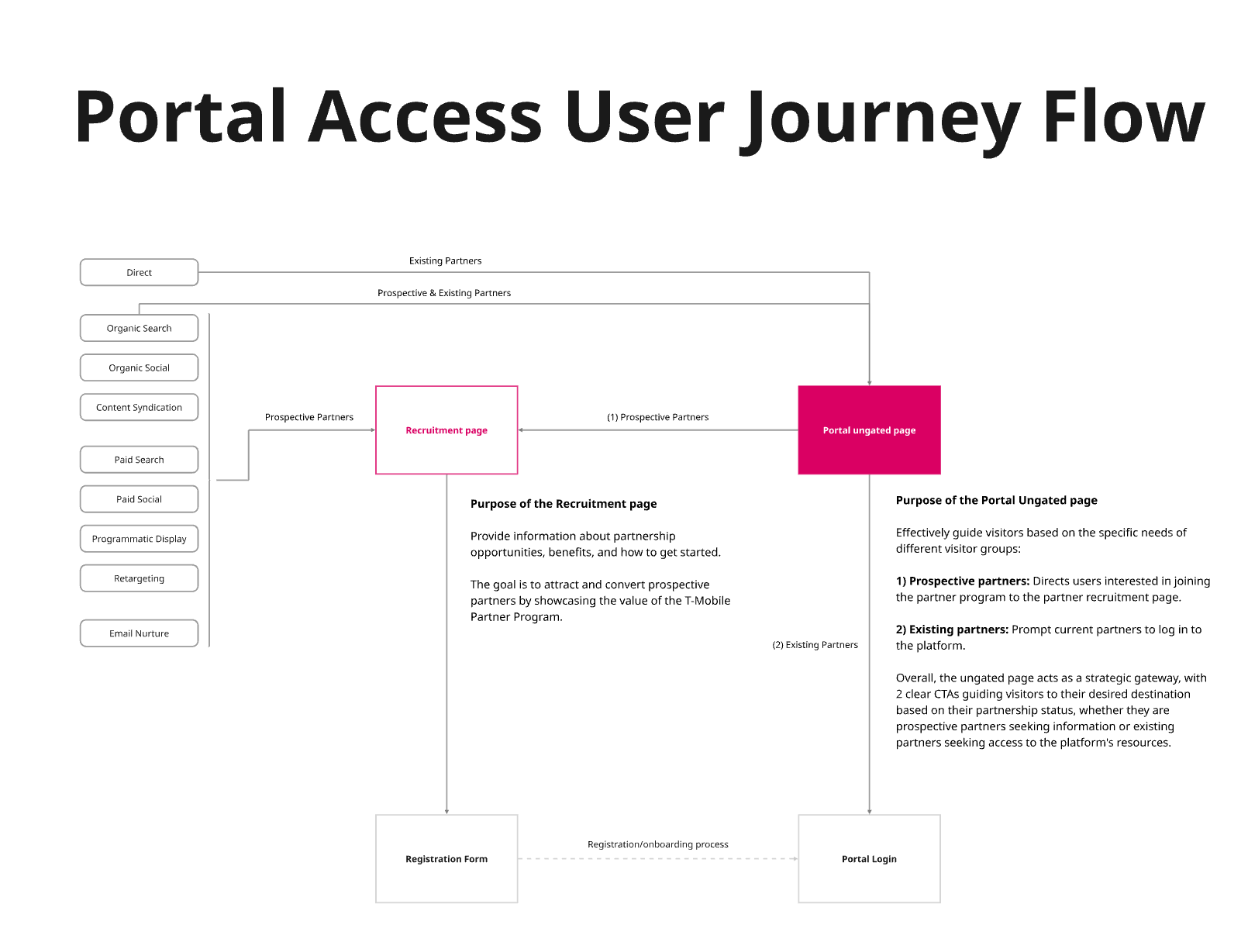
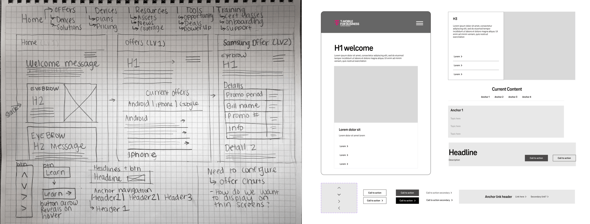
Our ideation began by mapping out user flows. In our discovery phase we had already found unauthenticated users (those without portal credentials) weren’t being guided anywhere. Instead of a helpful entry point, they were dropped onto a 404 page with no context, making it impossible to understand what the portal offered or how to get started.
Journey mapping
Support authenticated partners with a personalized dash
Recruit unauthenticated users through focused entry point
Through whiteboarding and sketching, we clarified the two distinct flows and aligned each to a specific journey goal. This shift helped clarify purpose, reduce confusion, and better support our recruitment and enablement goals.

Once we had alignment on the core problems, we moved into ideation and sketching. This phase was less about what to build first, and more about designing a system that could scale over time. We centered our approach around clear journeys, purposeful UX, and scalable systems both through time and pages. From this we defined our core structure: Distinct user flows, a modular IA aligned to our partner goals (get started, sell, learn more), and a flexible design system for repeatable content and tools.
Iterating on our findings
Rebuilding the experience
Our phased approach
Phase 2: UI and UX site revamp tailored to authenticated users, addressing usability pain points and modernizing the experience.
Phase 1 Recruitment: Urgent fixes like clarifying the authenticated vs. unauthenticated user flow—to streamline partner onboarding and drive activations.
Phase 3: Interactive partner tools introduced scalable, interactive tools—like 30/60/90 day plans, dashboards, and sales calculators—to future-proof the portal and empower partners long term.
01
02
03
This was a large-scale project, so we broke it into phases to prioritize impact.
rollout planning
T-Mobile’s original component library lacked key partner-specific tokens we had scoped for the portal experience. As we planned Phase 3 (focused on personalized journeys, training modules, and sales tools) it became clear that a custom component library was necessary. We presented a clear case to the T-Mobile team and gained approval to move forward with a tailored UI system built for partner needs.
Rebuilding the system

component library
Strategic wins:
We implemented reusable, CMS-friendly wireframes and components that flex across campaigns — from Power Up to T-Priority to Connected Laptops — enabling the client to scale and self-manage.
The design system bridges brand, content strategy, and user experience
Future solutions (Connected Laptops, T-Priority, Business Internet) can be launched faster with consistent UX.
Internal teams now have a reusable system that aligns to real partner tasks, they also know how to use it themselves to truly plug and play.
Our component library offered flexibility, repeatability, and fell within the brand vision to maintain consistency and user trust.
The homepage and IA were rebuilt around role-based priorities: onboarding, selling, training, and rewards. Navigation was restructured to support sales workflows at every level.
- Before vs. after component examples
- Component library tiles or pattern inventory
- A zoom-in on one reusable module (e.g., tabbed section or “My Journeys” cards)
Once wireframes and components were in place, we brought the experience to life through interactive prototypes. We shared early versions with key stakeholders to validate functionality and flow. We recorded the sessions, and I took notes on those recordings and optimized based on user feedback.
Validating the vision
Optimizing
What we changed
We implemented reusable, CMS-friendly wireframes and components that flex across campaigns — from Power Up to T-Priority to Connected Laptops — enabling the client to scale and self-manage.
- Added quick links and resource categories to reduce cognitive load
- Refined microcopy to align more clearly to T-Mobile’s voice and tone guidelines
+
Feedback highlights
The homepage and IA were rebuilt around role-based priorities: onboarding, selling, training, and rewards. Navigation was restructured to support sales workflows at every level.
- Done well: Partners responded positively to navigation and homepage
- Things to be improved: Two users tried to browse the site like it was live. Participant 1 hit the back button, participant 2 tried to access a part of the flow that was not prototyped; this was not possible (need to provide instructions)
- CTA language felt unclear to two users on mobile
Who we tested with
- Internal teams: marketing, sales ops
- CMS editors and content managers to ensure backend scalability
3
2
1
Screenshots or video snippets of the prototype in action
Figma comments or sticky notes from stakeholder reviews
A callout like: “Homepage v1 → Homepage v2 (based on partner input)”
The finished product
the fun stuff
✨
Push harder for a better marketing CMS, Impartner was limiting and we had to spend a fair amount of time pushing for a unique solution
Platform limitations

Ask better questions early on to uncover secondary stakeholders and nurture those relationships
Include outsiders

Getting face time with interviewees in our earlier research process to familiarize myself with their needs
Early research

Collaboration across product, content, and ops created alignment we hadn’t seen before
Collaboration

Rebuilding the component library made future campaign rollouts smoother and faster
Challenging a library

Breaking the experience into dual journeys gave partners more clarity and teams more control
Journey approach

The Partner Portal was a transformtion. We went beyond fixing pages or modernizing UI. We reimagined how T-Mobile empowers its partner ecosystem. This work pushed us past technical limitations, past business-as-usual thinking, and past what our team had done before. It deepened our relationship with T-Mobile and set a new standard for how we approach user-first design.
Designing beyond the screen
What I learned
What worked well:
What I’d do differently:


This project contains proprietary work created while under contract and is intended for portfolio review purposes only. Please do not share or distribute without prior permission.